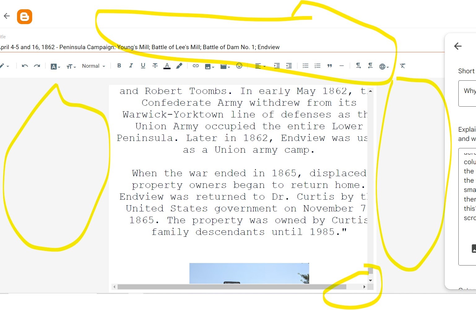
Several users were getting annoyed with Blogger post editor UI which, when larger image displayed, the horendous horizonal scroll takes effect.
When this happen, the texts in a paragraph will also flow outwards beyond the editor width, making it (a bit) harder to proof read & re-inspect the contents.
User's usually experience these issues on desktop with a wide/large screen monitor. The Blogger post editor display a small 700px in width, with some greyed out empty space to the left & right.
Why not make use of these empty spaces...
Why can't Blogger post editor has width adjustments?
Reasons being is because the editor features is hosted elsewhere (on Google servers) using an iframe where the assets could not be controlled or modified by users.
Why is the post editor width too narrow on larger screen sizes?
The width of the editor is set at max width 700px, it tries to mimic the width that most blogger post width set at a blog layout.
The post editor width is also dynamic, meaning when the screen size is smaller, say for mobile devices, the editor will be viewed in full screen.
How to customize the Blogger post editor display?
Use Google Chrome, with Chrome Extension Stylebot. You can custom style the post editor view to your liking, like your own fonts, colors, layout sizes etc.
How to use Stylebot Chrome Extension to modify Blogger editor UI widths?
- Launch Google Chrome app on desktop.
- Top left of browser, click Get Extension button
- At Chrome Extension search bar, type "Stylebot"
- At Stylebot extension page, click Add to Chrome, wait for the installation.
- Refresh your web browser then open your Blogger post editor.
- Top right of browser screen click Chrome Extension button again.
- Under installed extension Stylebot, click the Pin icon to enable & pin Stylebot to your Chrome browser window.
- Then at Styebot button, click then select Launch Stylebot.
- At Stylebot window pane bottom, click at "Code" tab
- Inside the Stylebot pane > Code panel, add these CSS declarations like so..
.a895je {
  max-width: 80%;
}
Automatically you can see the post editor view widths has expanded.
Change the 80% value to your own value of choice, where 100% equals to the parent container width for the editor.
With these changes you can see your post images in full view, with texts in its own paragraph not cut off hidden due to the horizontal scroll earlier.
You larger images will be in full view, you can easily set the image alignment left, center or right accordingly.
Use Preview to preview the final layout arrangemnets when rendered in your blog page.
Remove texts unwanted HTML formatting by select to highlight the texts, then click the Tx Remove Formatting button at editor toolbar.
Just remember, as long as Stylebot extension is installed, assigned to the domain to override the page view styles, your changes will be kept & saved.


Got It!
Data submitted via comments collected & stored by the respective providers.
Read our Privacy Policy to learn more on data management & protection.